-
Shop
- Adidas
- Advanced Technologies
- AI Skills Mastery 2026 Collection
- Best-Sellers
- Calvin Klein
- Car Accessories
- Confidence
- Dating & Social Skills
- Digital Resources
- AI & Technology
- AI Skills
- Beauty
- Budgeting & Saving
- Car Buying & Ownership
- Cozy Feast Collection
- Electronics & Technology
- Entrepreneurship & Business Growth
- Financial Education
- Financial Independence
- Financial Mindset & Psychology
- Goal Setting
- Hobbies
- Home Styling & Organization
- Kitchen & Recipes
- Leadership
- Mindset
- Online Business
- Parenting & Child Development
- Personal Style & Fashion
- Pet Lifestyle & Wellness
- Positive Thinking
- Sleep Improvement
- Stress Management & Relaxation
- Travel Planning
- Yoga & Fitness
- Yoga & Mind-Body Practices
- Education & Learning
- Family & Parenting
- Fashion
- Alexander McQueen
- Bags
- Bags & Wallets
- Balenciaga
- Belts
- Blazers
- Bottega Veneta
- Brunello Cucinelli
- Burberry
- Chanel
- Chloé
- Dior
- Dolce & Gabbana
- Dresses
- Etro
- Fendi
- Gucci
- Hats & Hair Accessories
- Hoodies & Sweatshirts
- Jacquemus
- Jewelry
- Jil Sander
- Keychains
- Kiton
- Luggage
- Miu Miu
- Off-White
- Prada
- Rick Owens
- Saint Laurent
- Socks & Tights
- Sweaters & Cardigans
- The Row
- Tom Ford
- Tops & Shirts
- Valentino
- Valentino Garavani
- Versace
- Vivienne Westwood
- Watches
- Furniture
- Gadgets
- Health & Beauty
- Health & Wellness
- Home & Garden
- Kids & Babies
- Kitchen
- Lighting
- Patio, Lawn & Garden
- Personal Growth
- Pet Care
- Pet Supplies
- Pets
- Shoes
- Smart Home Living Guides
- Sport & Outdoors
- Stress Relief & Relaxation
- TikTok Growth & Monetization Mastery
- Travel
- Travel & Adventure
- Wealth
- Wellness
- YouTube Shorts Best-Sellers
- Popular
- Best deals
Layered Texture Tablescapes: 7-Step Checklist + Maps
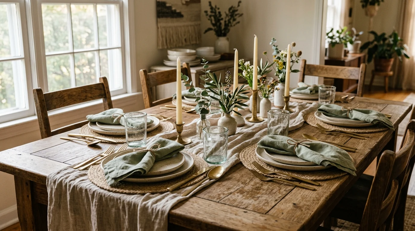
Layered Texture Tablescapes That Feel Collected: A Step-by-Step Checklist + Style Layering Maps
A beautiful table isn’t about owning “the right set.” It’s about layering a few purposeful textures—matte with shine, soft with structured, rustic with refined—so the whole scene feels inviting. Our team uses a simple build order (so nothing fights for attention), a practical checklist for setting your base, and style maps for cozy, rustic, modern, or elegant results—plus optional AI prompts to generate fresh combinations when creativity runs dry. For more guidance, see Set the Perfect Table with This Expert Guide.
Start with the “why”: the table’s job in the room
Before you place a single napkin, choose what you want the table to do. That one decision keeps every layer consistent and prevents the “pretty, but chaotic” feeling. For further reading, see Modern Wedding Decor Trends for 2026.
- Pick one primary goal: everyday comfort, celebration, romance, seasonal warmth, or clean minimalism. If you try to do all of them at once, your textures will compete.
- Define the conversation zone: keep the center low enough for eye contact. If you want height, group taller items into short clusters with breathing room between them.
- Lock in a tight color story: aim for 2–3 main tones plus 1 accent (a metal finish or wood tone). Once textures stack, a narrow palette reads collected instead of cluttered.
Step-by-step build order (the layering stack that always works)
When you build from the ground up, you can stop early and still look intentional—or keep going for a more styled moment.
| Layer | What to place | Texture goal | Quick rule of thumb |
|---|---|---|---|
| 1. Base | Bare table or cloth | Set the mood | If the table is glossy, add one matte textile |
| 2. Runner/Placemats | Runner +/or placemats | Add softness + pattern | Use one pattern max; keep the other solid |
| 3. Chargers/Plates | Charger (optional) + dinner + salad | Create height + framing | Formal = charger; casual = skip |
| 4. Napkins | Napkin + ring/tie | Add contrast | Match napkin to runner OR centerpiece—never both |
| 5. Flatware/Glassware | Fork/knife/spoon + water/wine glass | Add shine + line | Keep metals consistent unless intentionally mixed |
| 6. Centerpiece | Greenery + candles + florals | Create a focal path | Keep tallest items off direct sightlines |
| 7. Finishing | Place cards, small bowls, accents | Make it feel intentional | Repeat one small detail at each setting |
- Layer 1 — Base: let wood grain be your first texture. If your tabletop is glass or high-gloss, soften it with a runner, placemats, or linen cloth.
- Layer 2 — Foundation textiles: mix one “quiet” textile (linen/cotton) with one “character” textile (woven, boucle, gauze, or a subtle pattern).
- Layer 3 — Plate architecture: stack dinner plate plus salad plate/bowl. Add chargers only when you want extra structure (formal or modern graphic).
- Layer 4 — Napkin + ring detail: napkins are your easiest contrast lever—crisp cotton for modern, rumpled linen for rustic, soft cotton for cozy.
- Layer 5 — Glass + flatware: keep metals consistent (all warm, all cool, or a deliberate mix with one dominant).
- Layer 6 — Center: build in thirds: low anchors (greenery), medium focal pieces (candles/flowers), small accents (fruit, stones, bud vases).
- Layer 7 — Light + finishing touches: taper candles, votives, or one sculptural object—then repeat one tiny detail at each setting so it reads “planned,” not random.
Texture pairing rules that prevent a busy look
- Balance matte vs. reflective: shiny glass and metal look best when “calmed” with matte ceramics or linen.
- Choose one hero texture: chunky knit runner, rattan chargers, hammered flatware, or stoneware plates—then keep supporting textures quieter.
- Echo textures twice: if you use a woven placemat, repeat that weave in a bread basket or simple napkin tie for cohesion.
- Keep patterns on a leash: commit to one patterned layer (runner OR napkin OR plate rim). Let texture do the heavy lifting everywhere else.
Style maps: cozy, rustic, modern, elegant (choose one and follow it)
Cozy
Warm neutrals, soft textiles, candlelight, rounded shapes. Keep edges soft: washed linen, speckled stoneware, amber glass, and low candle clusters.
Rustic
Natural fibers, imperfect ceramics, wood + iron, greenery, hand-tied napkins. Let grain and weave show, and don’t over-symmetrize.
Modern
Fewer items, bolder contrast, clean lines, intentional negative space. Pick one sculptural centerpiece and let it breathe.
Elegant
Taller glassware, refined napkin folds, cohesive metal finish, symmetrical placement. Add shine in two places—flatware plus candleholders—so it feels elevated without feeling loud.
Centerpieces that photograph well and still feel livable
Make it repeatable: a 15-minute reset routine
Tools and upgrades we keep on hand
- Layered Texture Tablescape Checklist + AI Inspiration Download (a quick reference you can reuse for cozy, rustic, modern, or elegant builds)
- Heart Shaped Crystal Ceiling Light for a dining-room glow moment (because the fastest way to make textures look richer is better lighting)
- Elegant Casual Leather Tote Bag for Everyday Style (handy when you’re carrying linens, taper candles, or a host gift to dinner)
Helpful table-setting references
FAQ
How many layers are too many for a tablescape?
Seven layers is a practical maximum; beyond that, the table starts to feel crowded and less usable. Keep it livable by choosing one hero texture and limiting yourself to one pattern. For weeknights, a simple four-layer version (runner or placemat, plate, napkin, glass) still looks finished.
How do you mix textures without making the table look messy?
Stick to a limited palette, balance matte with shine, and repeat one texture at least twice so the mix feels intentional. Keep the centerpiece contained in a clear “path” down the center rather than scattering items across the whole surface.
What’s the easiest way to make a simple table look elegant?
Use one cohesive metal finish, crisp textiles, and slightly elevated glassware, then lean into symmetry and candlelight. A quick upgrade that reads instantly elegant is adding chargers or a set of napkin rings.









Leave a comment